
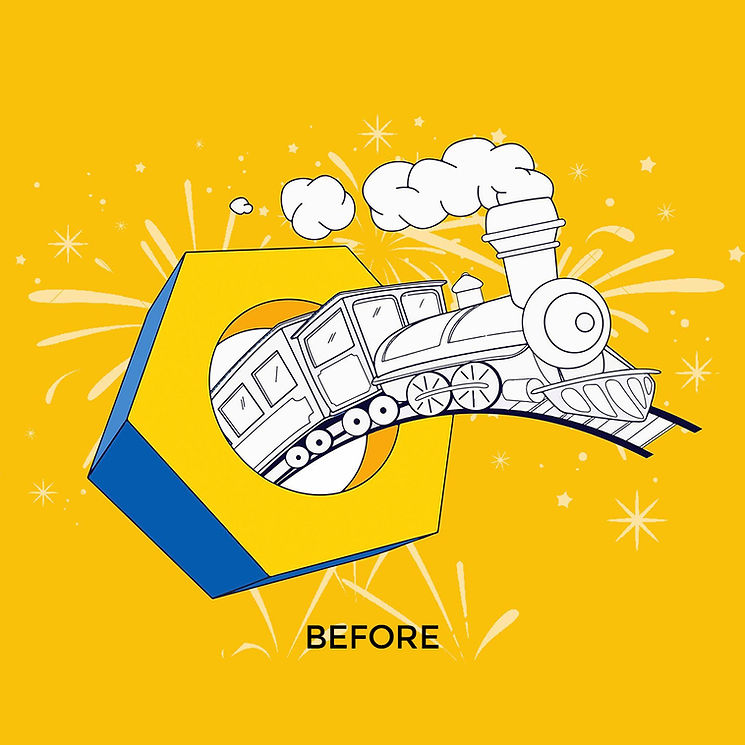
THE BRIEF
The client, JD, the owner of a hardware store based in France, approached me with a clear goal:
to modernize their logo while honoring their heritage.
Specifically, they wanted to:
• Retain elements of their original logo featuring a locomotive
• Keep the blue - yellow color combo
• Maintain a bold, utilitarian aesthetic that resonates with both traditional and contemporary hardware shoppers
They were after a more minimal look and needed a design that will be attractive to their customer base that consists of DIY enthusiasts, contractors, and general consumers seeking quality tools and hardware products.
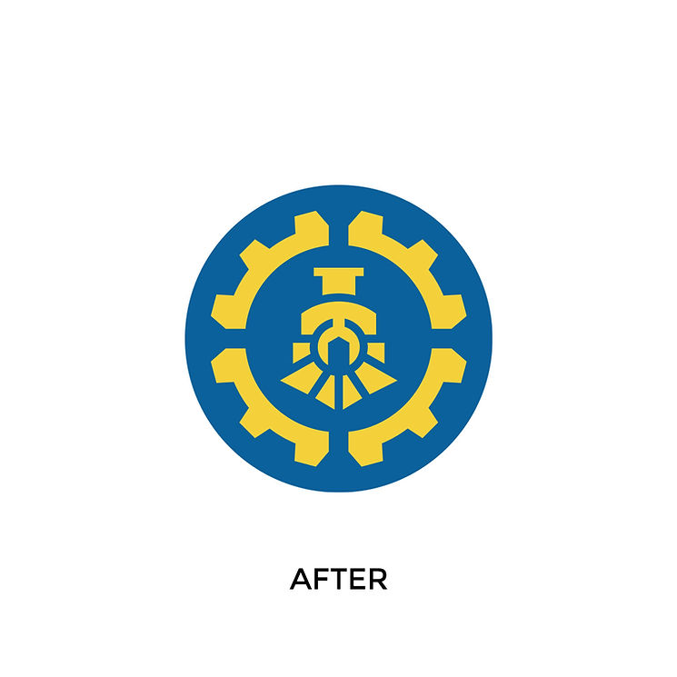
THE SOLUTION
I simplified the logo by combining 3 elements: a locomotive, a gear, and since the store is located in France, I wanted to incorporate
a subtle nod to that, a wrench (also known as a French key).
The locomotive is the heart of the logo, paying homage to the original design, with the wrench is seamlessly incorporated in
its center and symbolizing the core product focus - tools and hardware. The gear, a classic industrial symbol, forms the outer boundary of the logo.
The logo circular form and single-color simplicity make it ideal for embossing, engraving, and screen printing. The high contrast between the yellow and blue ensures visibility across different applications.
The design exemplifies how thoughtful integration of legacy elements can bring new life to a brand.
JD informed me that the new logo has been met with enthusiasm by long-time customers, while also attracting a younger,
design-conscious people.


